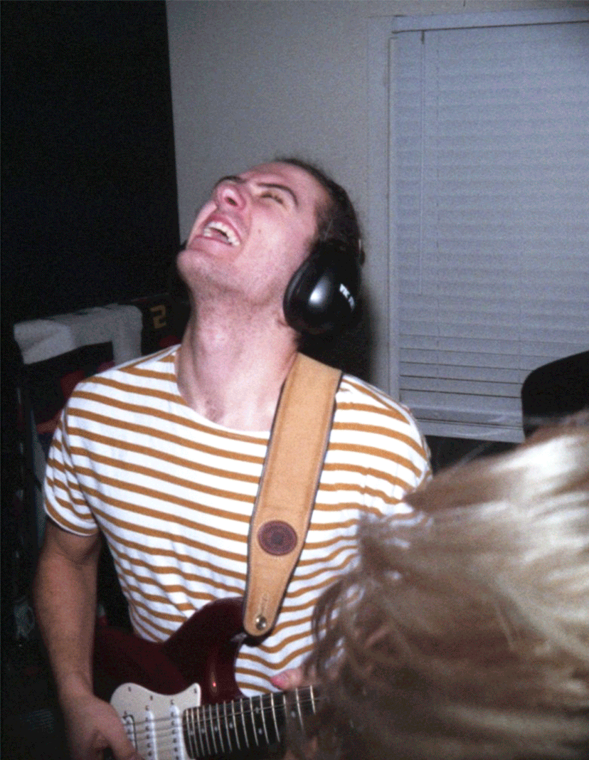
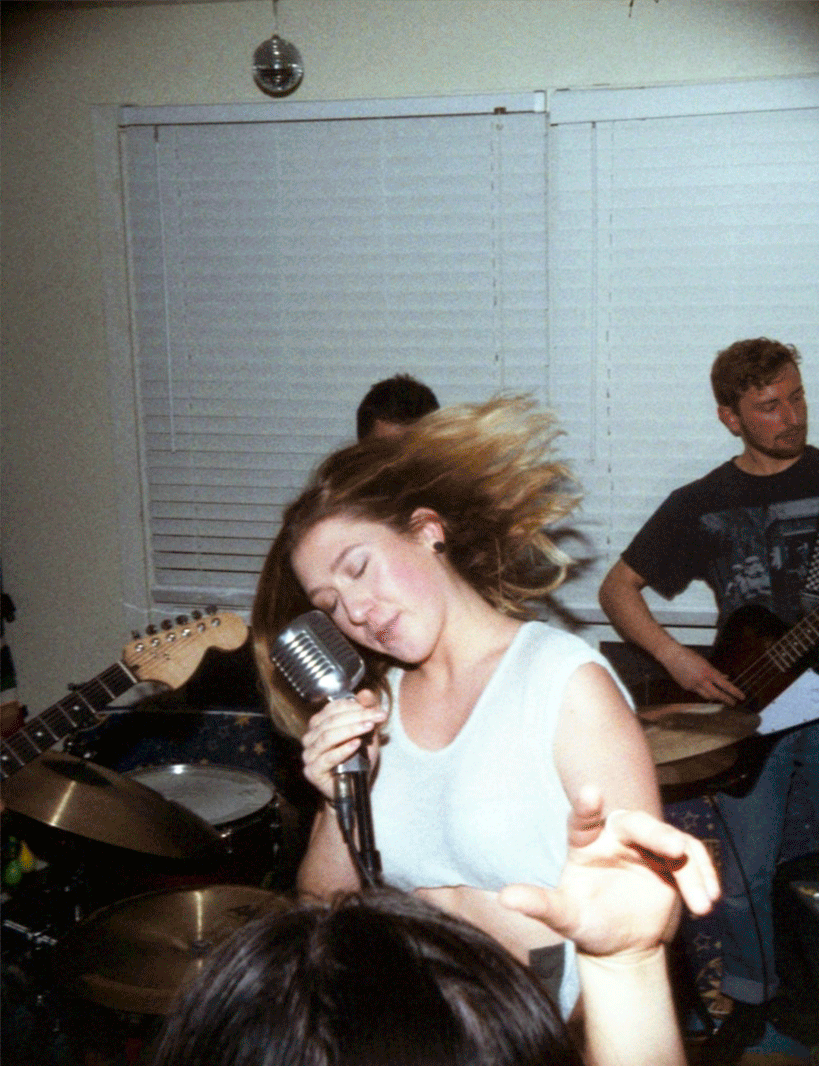
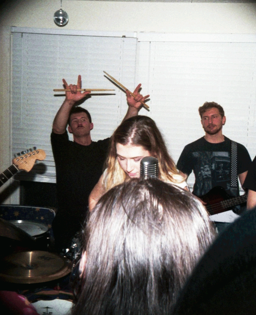
The third edition of our famous House Party that's actually an arts night.

Above is a page of logo and theme ideation
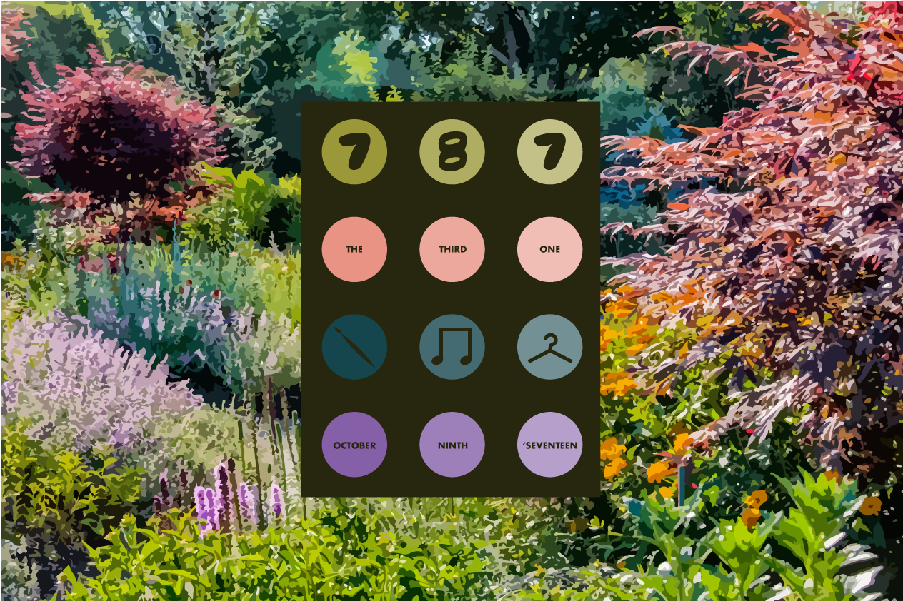
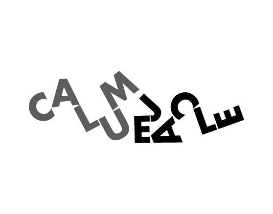
I then used illustrator, taking the telephone-like approach to layout the title, graphics and date.
The colour palette is always crucial for my events because of their emotive function, so I tried sourcing a palette of a lush and natural landscape, reminiscent of what the event could be.
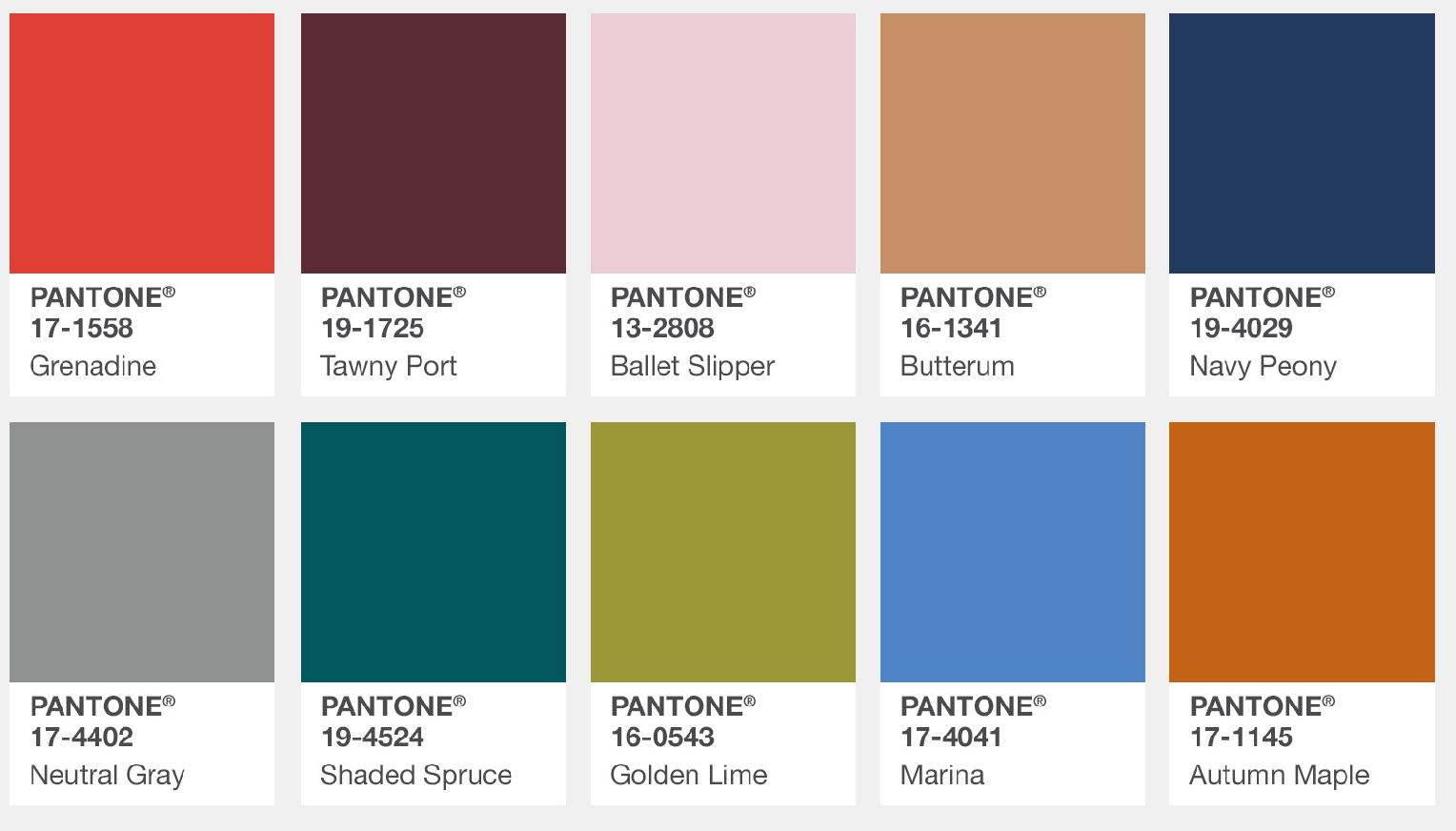

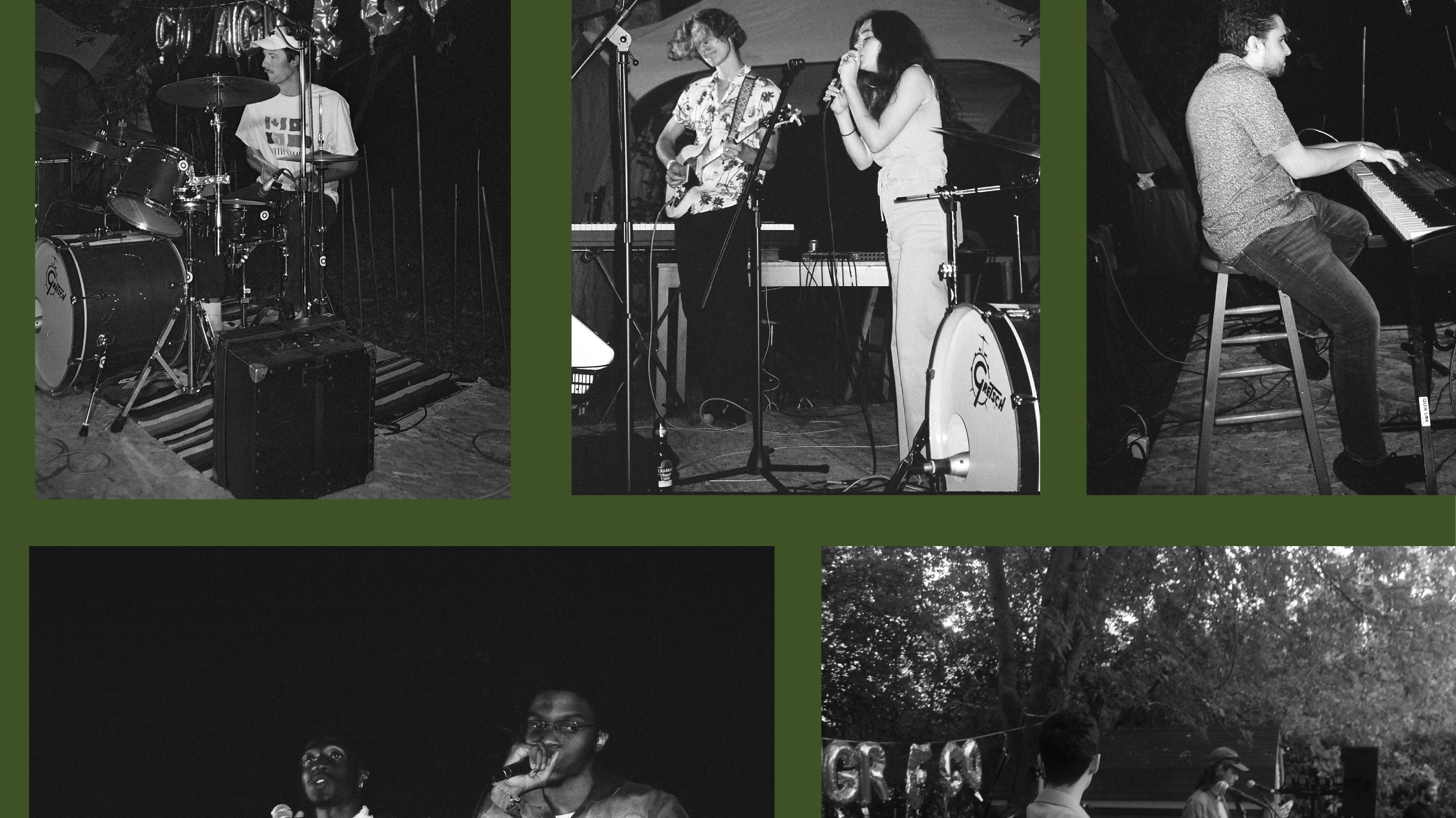
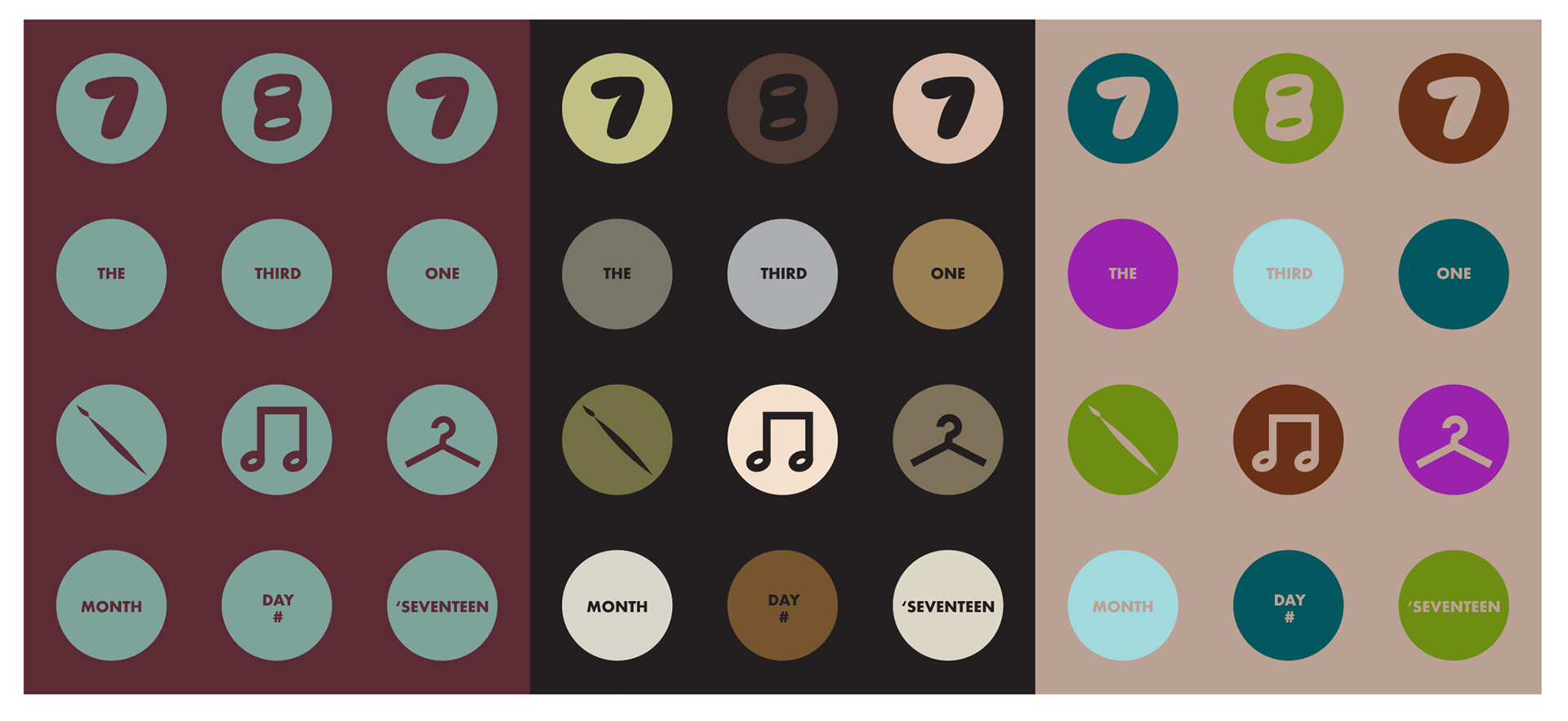
Because the theme is so important to the tone of the event, I wanted this event to feel warm and cozy since it was taking place in the winter (the cold Ottawa winter). I then looked at the Pantone colours list of 2017 and instantly fell in love with Grenadine, Autumn Maple and Golden Lime as shown above. The middle option was the branding we decided on.
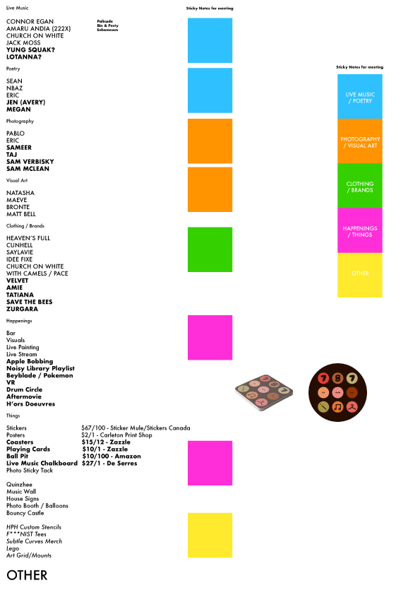
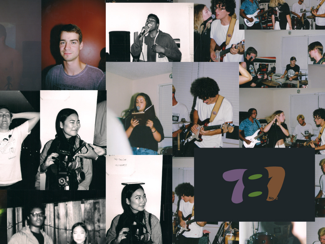
These were the meeting notes of potential ideas and discussion topics with colour coded sticky notes. If you see your name here that means we were interested at one point and probably still interested for future events!

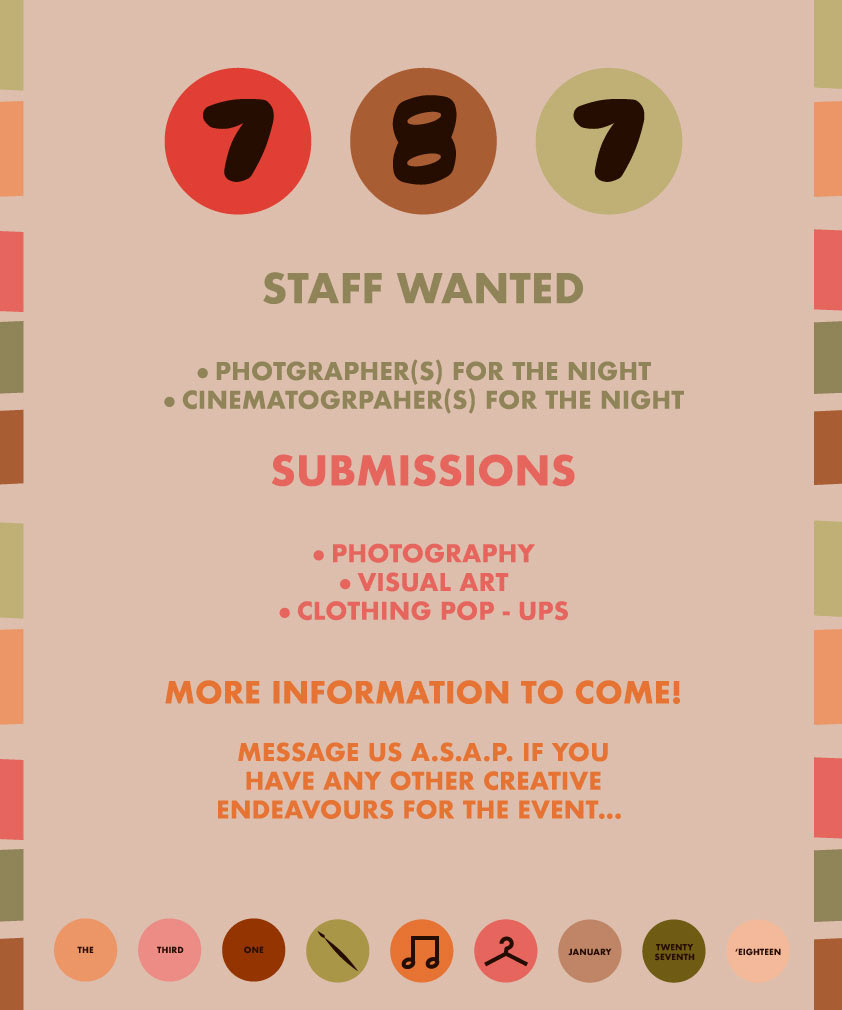
Above is the process that I went through before sending out the bottom picture as a save the date for the event. The final picture is a call for volunteers and submissions, the backbone of the events.
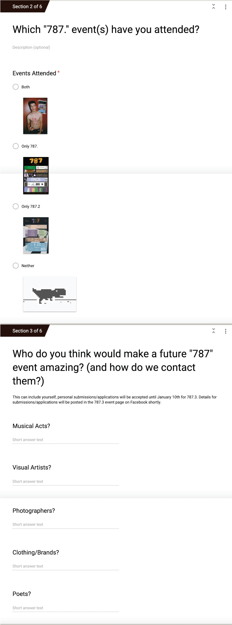

As with 787.2, we wanted as much past event feedback and future event input as possible to make an improved event and one better suited for its attendees. We even sent out a user survey for more detailed feedback and to receive suggestions for musical acts, local clothing makers and visual artists.

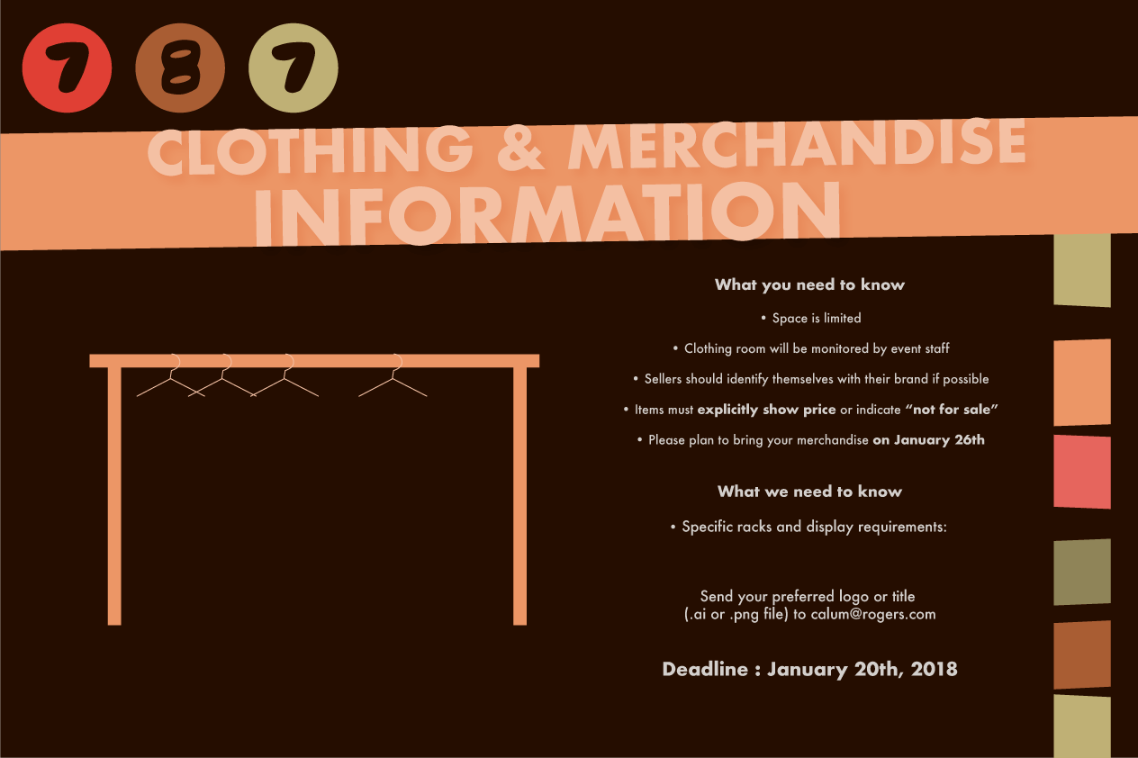
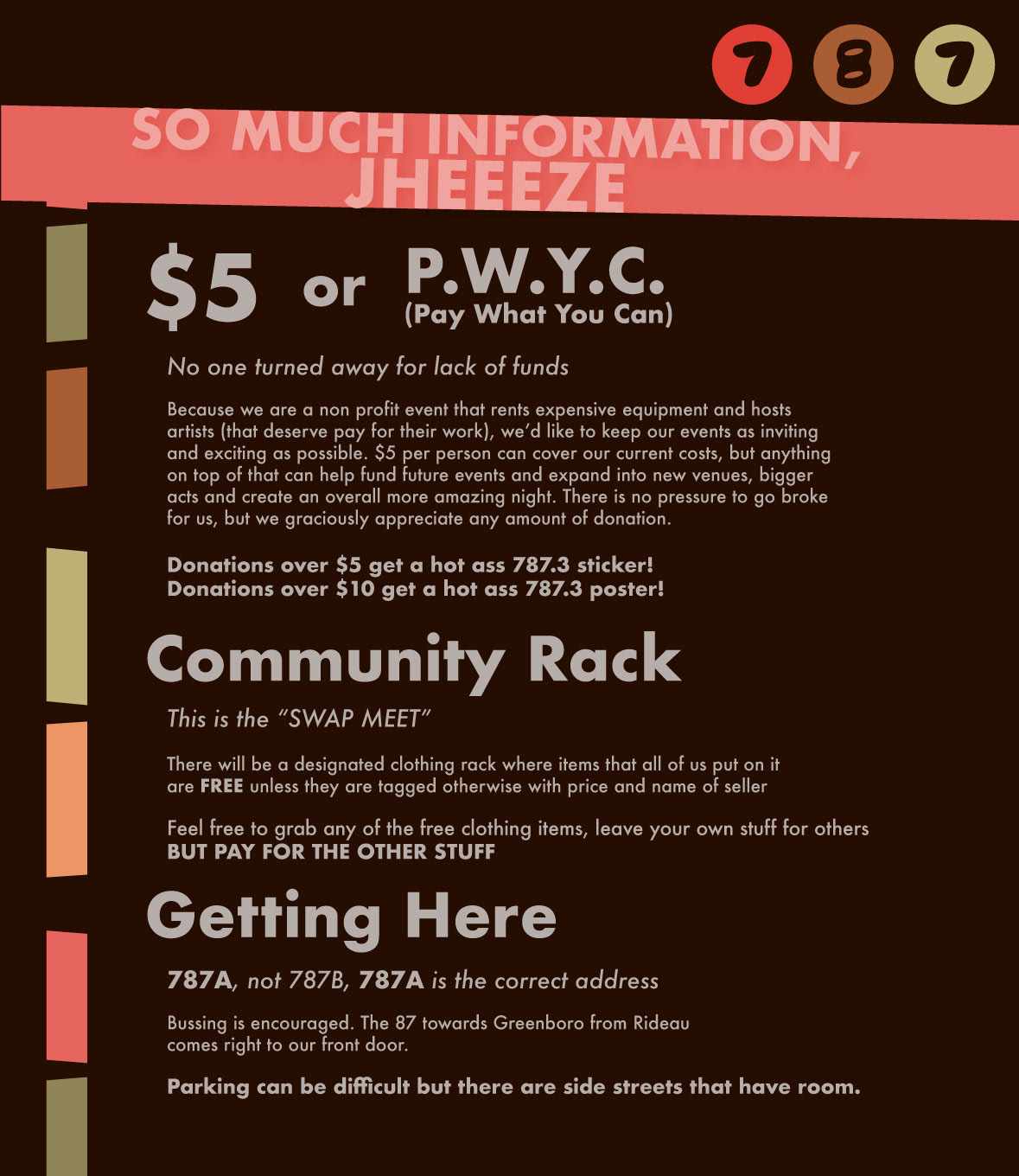
The 3 posts above were sent out to give some more information for artists wishing to sell or display their items as well as more important event-roll out details to avoid any confusions. There is typically a lot of questions on the days before the event so I made sure to include as many details as possible here so that I could focus on setting up with the team of organizers.

On the left is the menu that I made for the bar after being given the drink options from my friend / event co-host and bartender, Jack <3. The warm options were well enjoyed since the bar was in the back as you'll see in the house map.
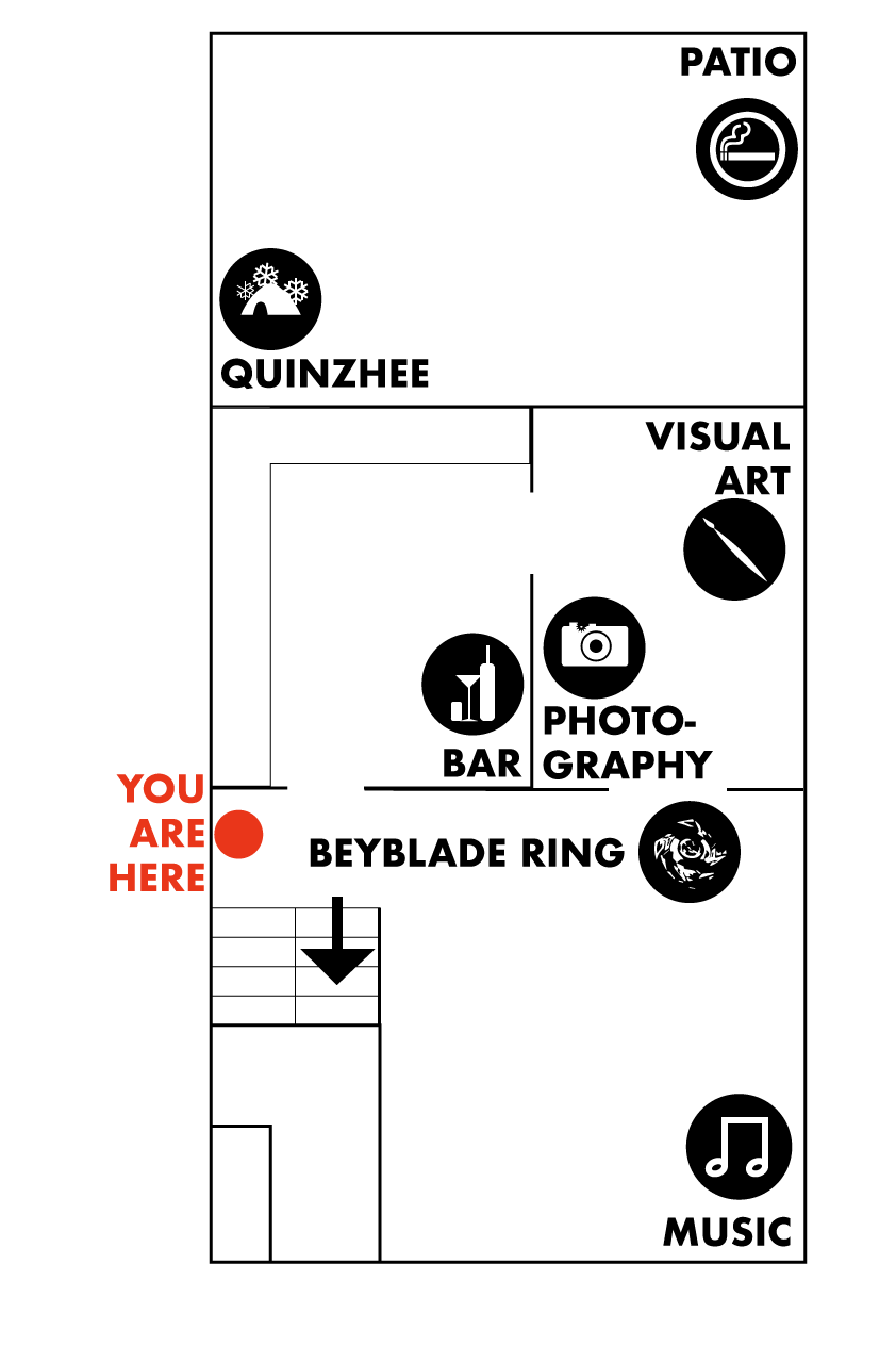
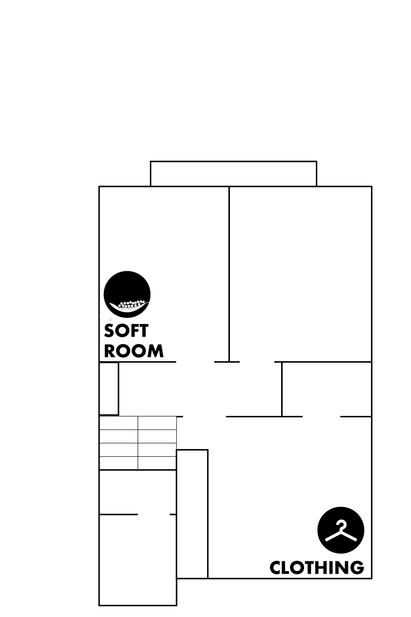
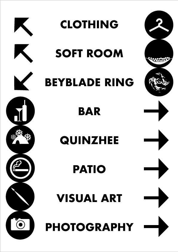
We never ended up printing these posters because of the timing and a general overload of things to do, but these would have in theory directed people more efficiently through the crowded townhouse. The sign on right would have been right near the entrance to the house (the red dot on the middle map).
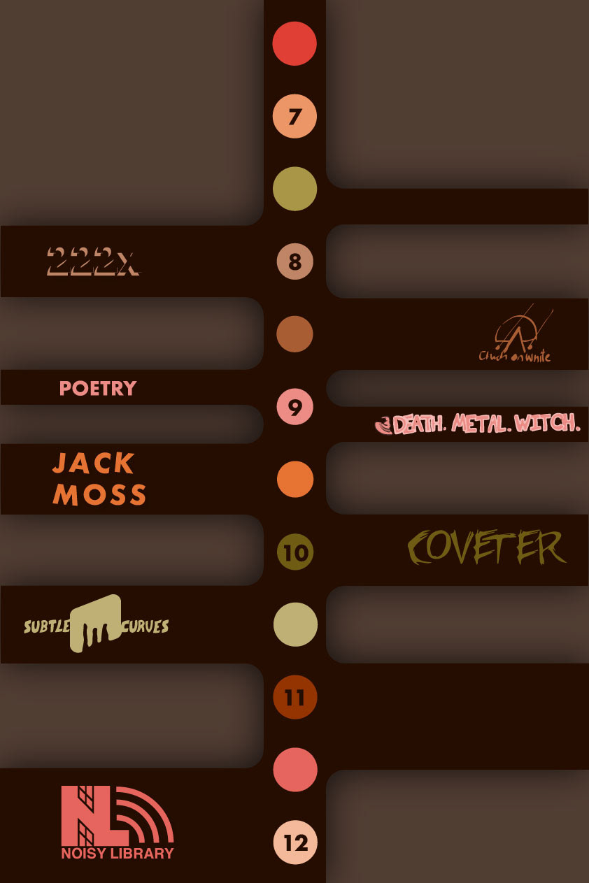


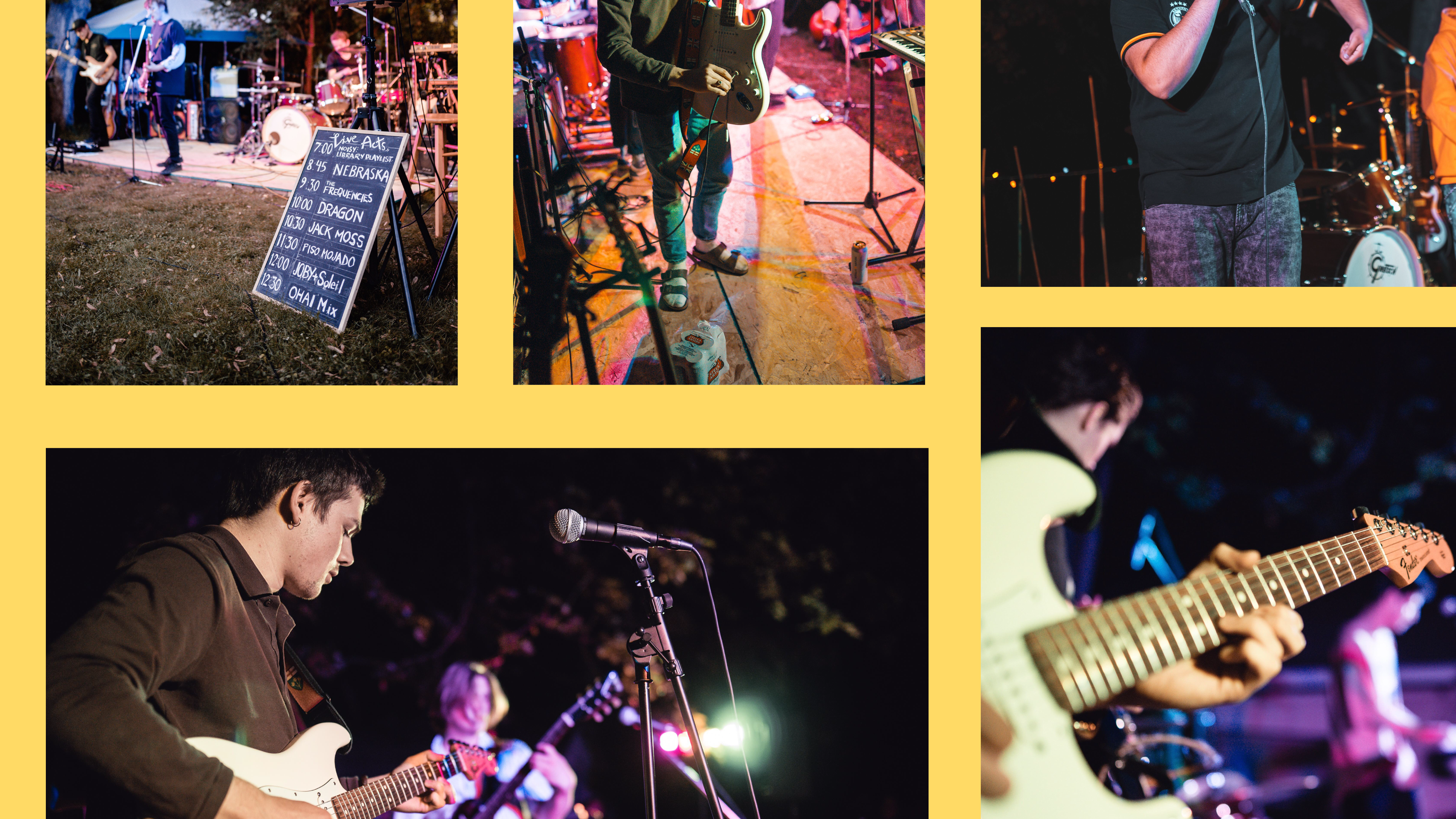
Above is the process that I went through to create a musical lineup for the night. As acts got moved around, added and removed, there was a need for adjustments as seen between the last two steps.
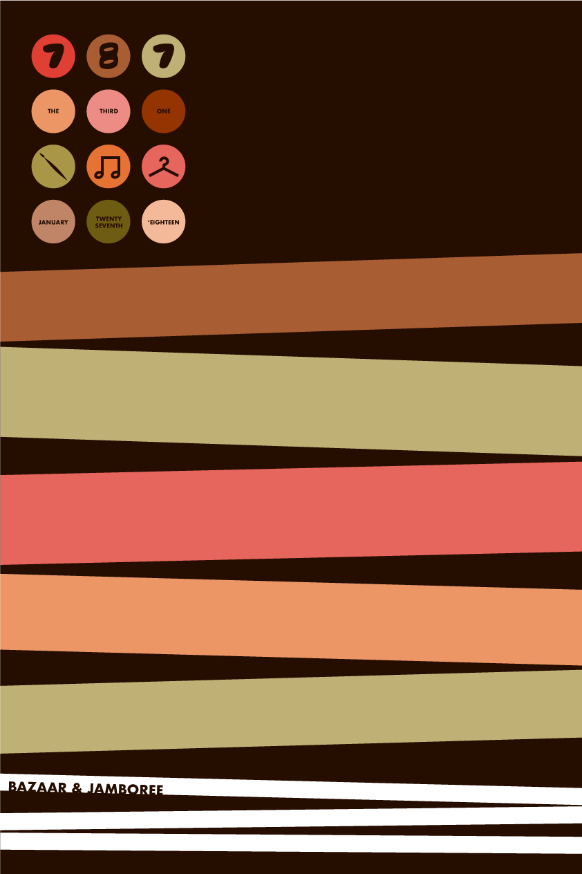
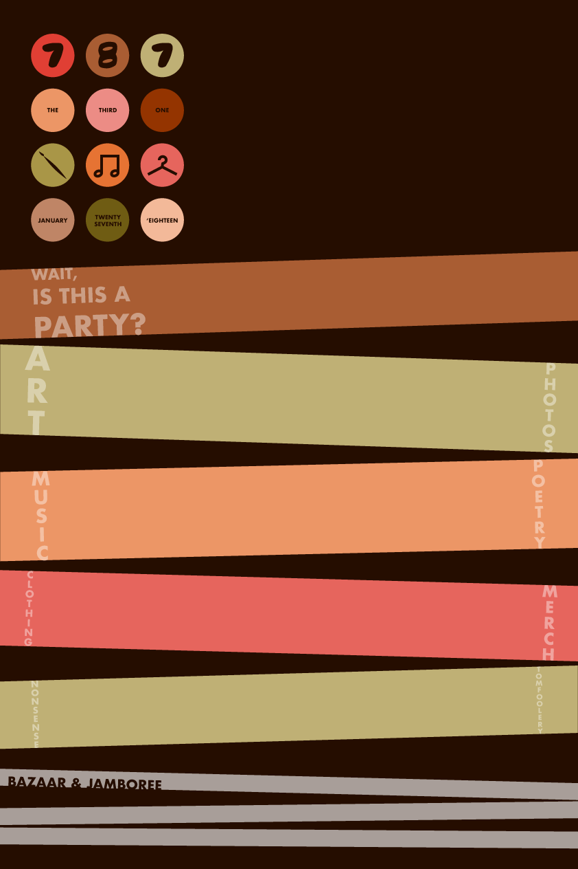

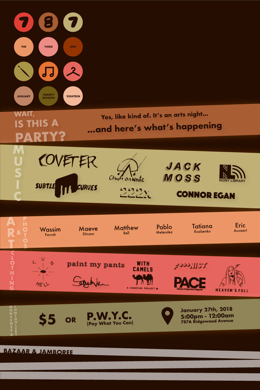

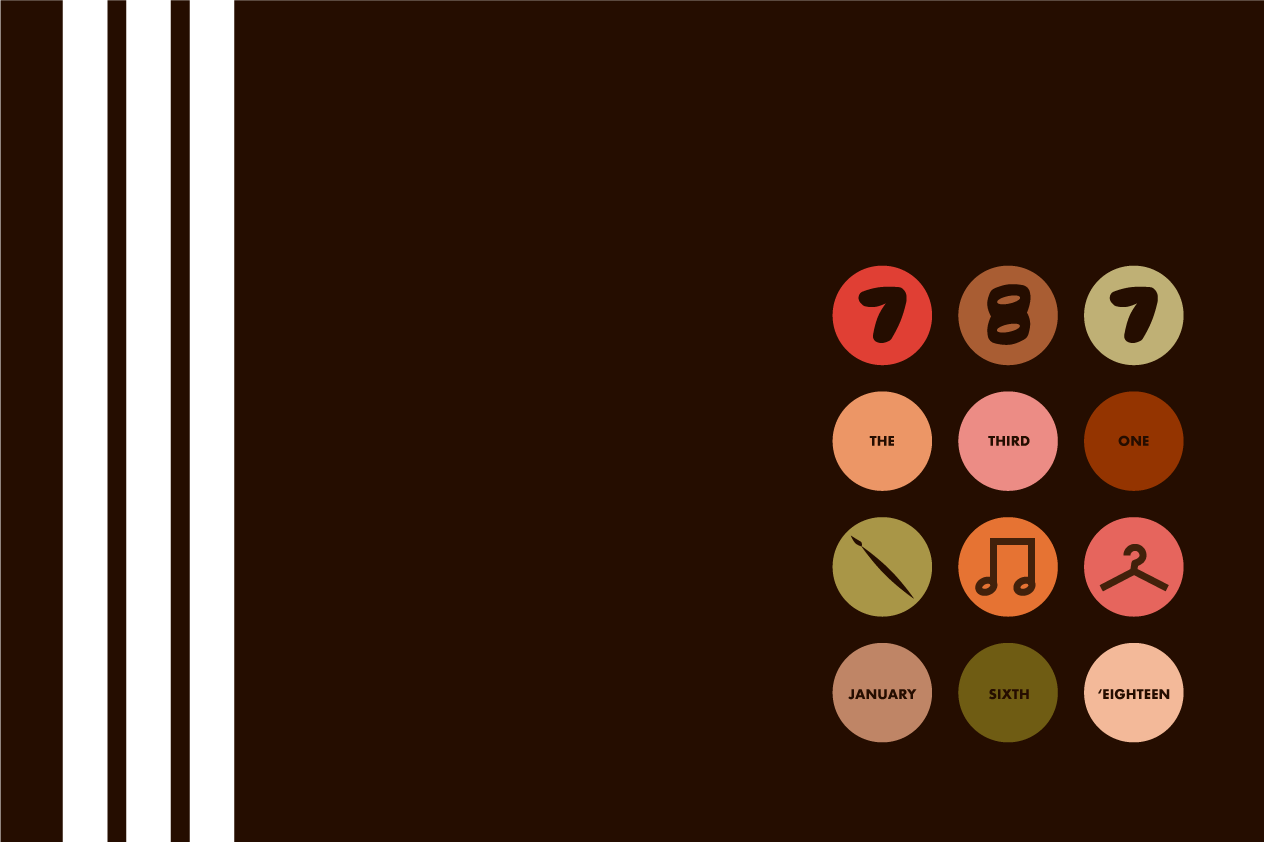
For the final poster, I wanted to communicate the idea of a collection of ideas from a range of artists, all unified for an event. The slanted bars represented an idea of wrapping posters or tape around a poll in a sort of chaotic yet fun way. As I further developed the appearance I added drop shadow effects on these bars to give the poster depth and reinforce the visual idea of layering and bringing your own styles to an existing backdrop, just like the event itself.